Using Vividloom to create a free logo is really simple. We’ll start by generating a few ideas for you based on your company name and the industry you work in. You can then pick your favorite and if you feel we are not one hundred percent there yet, we’ll generate hundreds of variations for you. You can customize fonts, shapes and colors. Next, we’ll look at the finer details and customize the logo until it is exactly what you are looking for. That’s it. You’re done. In three easy steps, boom, you have a logo!
Ok, but if it’s so easy, it means anyone can do it. So how can I take my logo to the next level? How can I use Vividloom to get that edge on my competition? Isn’t that what a designer is for?
Because your logo is the primary symbol of your identity, we know how important it is to get it just right. We appreciate designers and the amount of time and practice they put into understanding and applying the principles of good design. It’s complicated stuff and takes years to learn and master. We also know that you might not always have the time to find a designer. Sometimes it’s a case of time or budget.
It’s a daunting task for any business owner to have to learn color theory, design elements and principles, composition and hierarchy, typographic theory and stylization in order to create their own logo. Therefore, to make things a little easier, we’ve put together a condensed version of some of the most important things to consider when designing your logo on Vividloom, in order to give your logo that extra je ne sais quoi. Here are our top five tips:
Rotate it

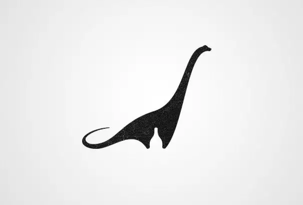
This is something that even most designers don’t always think about. A logo’s symbol can be a powerful visual, but it needn’t be ‘the right side up.’ Sometimes, a gentle nudge or turn can help balance your logo, creating symmetry or just make it feel right. This is especially worth trying if your symbol is circular in shape! Think of Pepsi’s symbol and how it is slightly rotated to the left. It just gives the logo that something extra.
Scale it
Another good one it to think about proportion. Specifically, the proportion or ratio of your text (wordmark) to the symbol. Often, we see creators scaling either the wordmark or the symbol up too much and so engulfing the other element. A good rule of thumb is that the symbol is usually larger than the wordmark. Also, you’ll want to work in thirds. So, the wordmark would be two thirds the size of your logo (or just slightly less). This isn’t a hard and fast rule, but it is something to consider if your logo will need to work at smaller sizes (as an app thumbnail, for example).
Position it
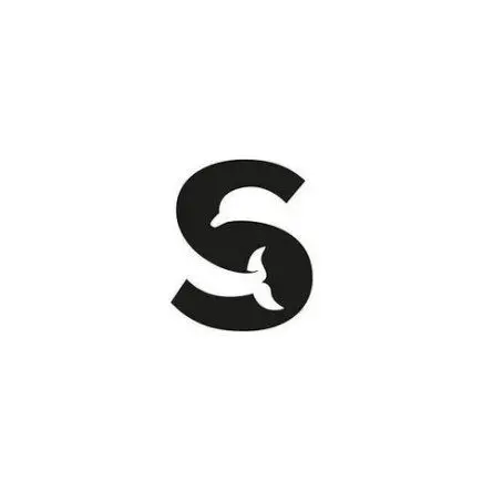
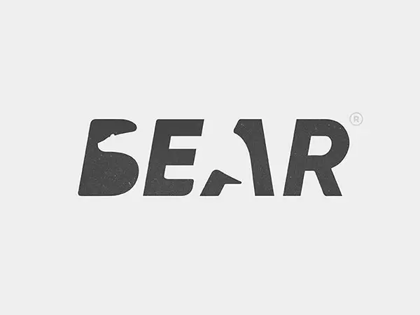
Layout and hierarchy are often tricky principles to get right, but they are also immensely important aspects in any logo arrangement. Typically, the logo’s symbol is positioned either on top or to the left of the wordmark. However, a logo’s symbol does not always need to follow this layout. A handy trick is to think about the concept behind your logo and brand. For example, if you’re a deep-sea diving company (let’s say your brand name is ‘Down Under’) it could be a neat idea to position the symbol under the text. Maybe you’re a meditation brand named ‘Soul Calm.’ Perhaps balance and symmetry are important values to your brand. In this case, why not try to place the symbol between the words, soul and calm.
Stack it (or don’t)
This is another layout consideration. This time, let’s take a moment to consider where your logo will ultimately be displayed. If your company operates primarily online, you’d need to consider how your logo would function in both horizontal and vertical formats, for both desktop and mobile views. Think about it, if your logo is designed in such a way that it can only be displayed in a horizontal format, it might take up too much space on your home page in mobile view. On the other hand, if it only works as a ‘stacked’ logo (we use this term to mean a logo with the symbol atop or below the wordmark), it is going to make the header of your desktop site too high and thus take up an unnecessary amount of space. For this reason, we recommend ‘unlinking’ your symbol and wordmark, so that it can work either horizontally or as a stacked logo.
Color it
We’ve left the best for last! Color is arguably the most important aspect of any logo (or design for that matter). What’s more, the human eye can see and distinguish between over 10 000 000 colors. This is incredible, but it can also make choosing the appropriate colors for your brand difficult.
Colors have meaning but they also evoke emotion. For example, red represents good luck in China, whereas in South Africa, it’s a color of mourning. Moreover, in the U.S., red is often used to stimulate our taste buds. Red is also a very intense color and is often used to evoke love, passion or anger. On the other hand, greens and blues generally tend to be more calming and typically represent health, growth and serenity. Yellow is considered a happy color (kids usually gravitate toward yellow) unless you’re in Germany, where it might suggest greed or envy.
Another aspect to color is how to pair colors in a harmonious way. There are so many ways to approach this, but we’ll give you a few things to consider.
First of all, work with different color harmonies. You can stick to a monochrome (one color) logo like Starbucks, Target, AirBnB or Yahoo!, or try to introduce a neutral color (blacks, whites, greys or beiges) as a secondary color to ground the primary color (think of Nikon, KFC, BMW and Amazon). If you’re trying to communicate fun, creativity or playfulness, you could make use of primary colors (red, blue, yellow and sometimes green) like Google, PlayStation and Microsoft. Alternatively, you could go for complimentary colors (colors that sit at opposite ends of the color wheel if you’re looking to create a bold or striking logo like FedEx or Firefox (Complimentary colors pair either red and green, blue and orange or yellow and purple). Or, work with analogous colors (colors that sit next to each other on the color wheel) if you’d prefer to go for something more harmonious, calming and modern like Calm or Headspace (analogous colors couple reds and oranges, oranges and yellows, yellows and greens, greens and blues, blues and purples or purples and reds). There are many other options, with brands such as NBC and Instagram even embracing a spectrum of color.
There are of course many other things to consider when designing your logo on Vividloom. Because the number of options are endless, it can get overwhelming. However, if you stick to the simple tips mentioned above, you’ll no doubt end up with a solid, well-designed logo.
All that’s left to do is to get stuck in and have fun creating your logo!